
Best Buy 3D Viewer
I led my UX/UI team in the research, strategy and design of the 3D Virtual Appliance viewer. The app helped increase conversions by 3 to 15% on these products and was a huge success for the vendors.
Role – Associate Creative Director, UX
UX Team – 3 UX Designers

New models = sales lag
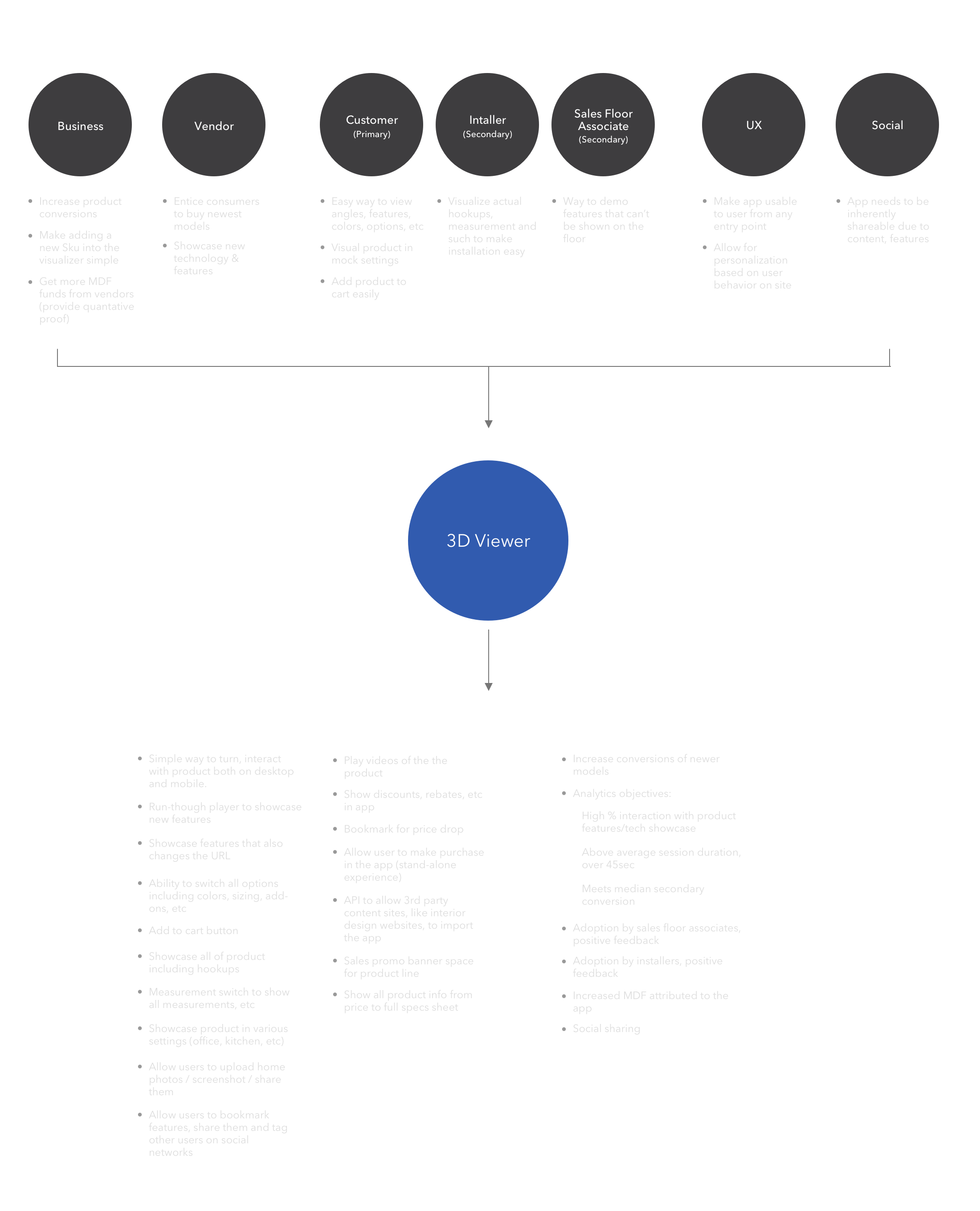
New models of applicances were experiencing an overall sales lag. A product manager came to my team with vendor funding looking for a way to showcase new appliances in some sort of 3D viewer. We spent several days hammering out a very preliminary feature set.
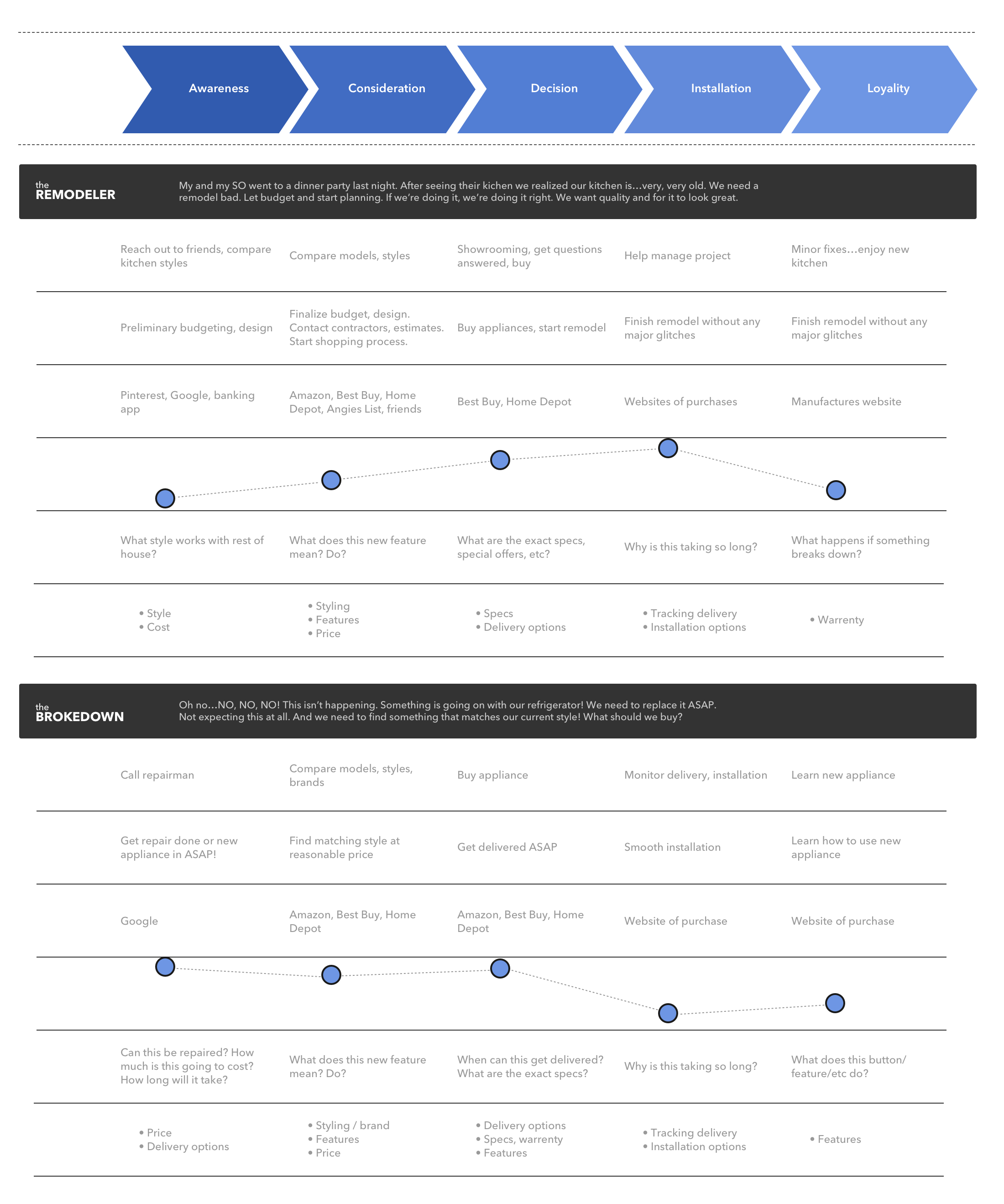
The journey map
What exactly is this app? What customer pain points are we trying to solve? My team talked to recent customers, identifying two main types with the higest purchase intent and mapped their journey. This was a huge help in answering the two questions above.
The Research Findings
New features = the pain point
This was the main pain point we needed to focus on. Customers were confused by the new features / technology. What did they do? Advantages? They wanted to see, visualize it, see it in action.
Internal is home
Don't put the app anywhere but inside BestBuy.com. Customers never mentioned visiting a microsite, external vendor's site, etc during the buying process.
Yes, purchase intent went up
When customers actually interacted with the product in any fashion, their purchase intent went up. Especially when a floor associate was there to answer questions.
AHHHHHHHH, Stress relief
When we described the app to customers, they got very excited and stated strongly it would reduce a lot of the stress of paying extra for the latest models or just knowing what a features does.
Color...color...color
Over and over again customer mentioned the style and color were the most important options when buying a new appliance. We needed this for MVP, not all the other ideas.
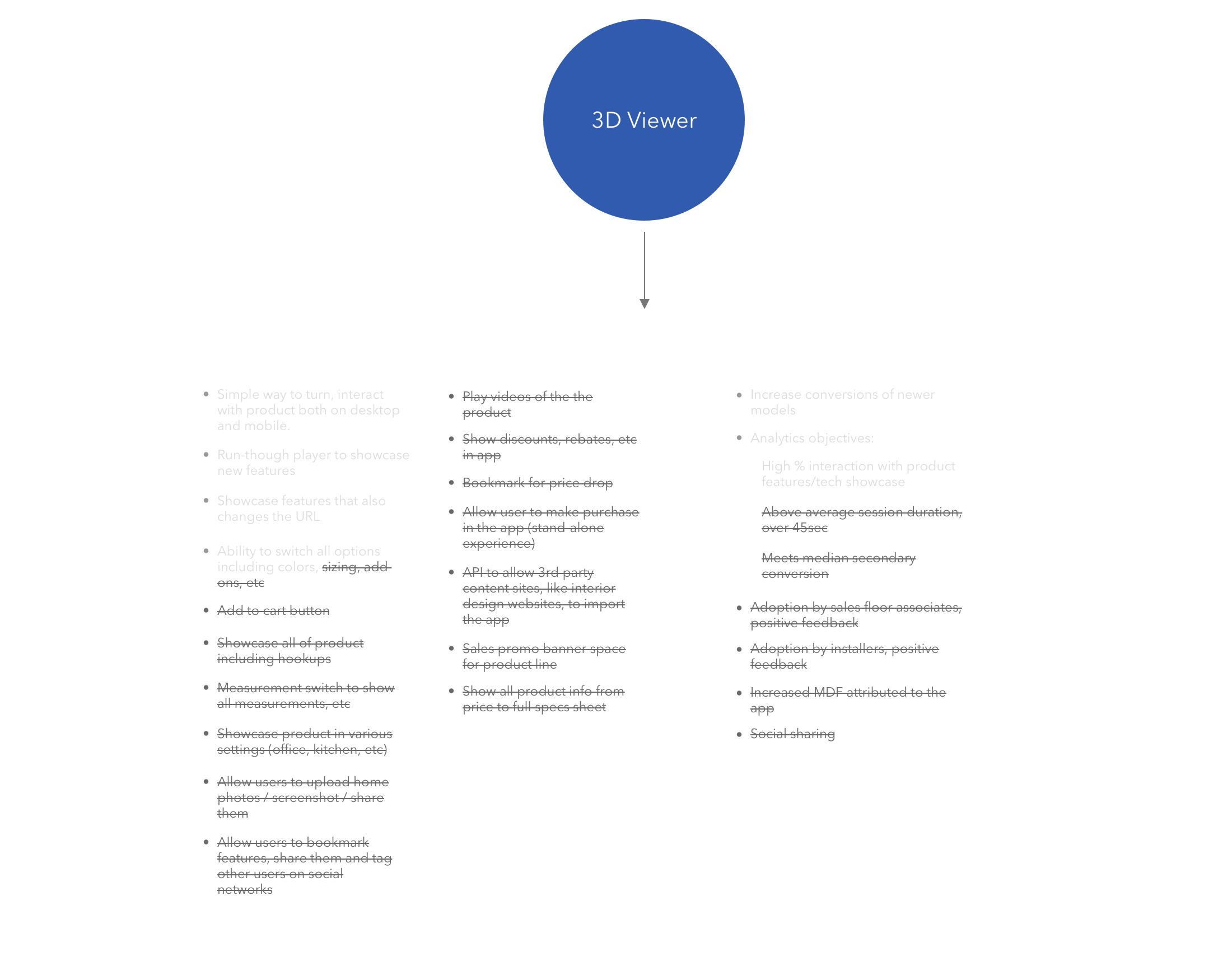
Narrowing the feature set
After reviewing the research and journey map with the product manager, we worked with the stakeholders and dev team to narrow down the feature set to a manageable MVP.
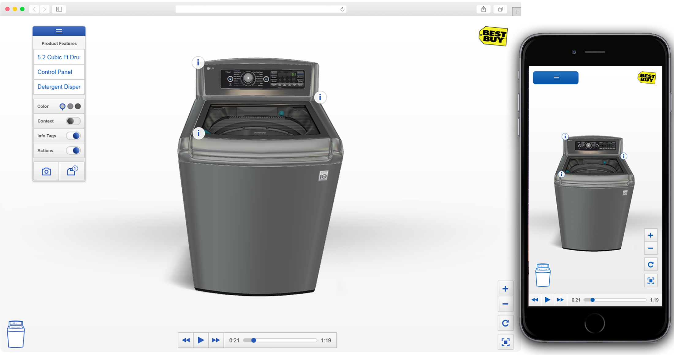
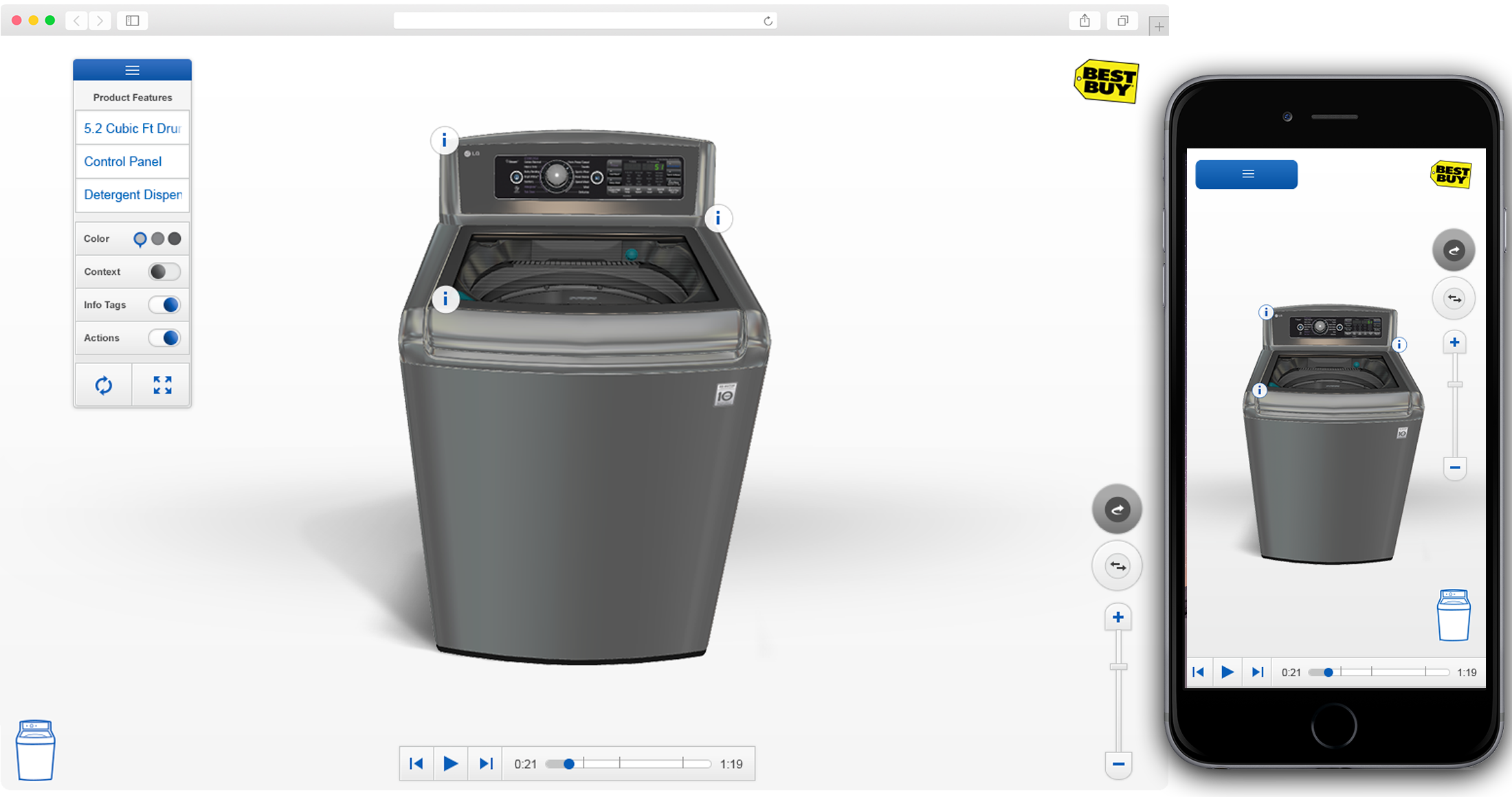
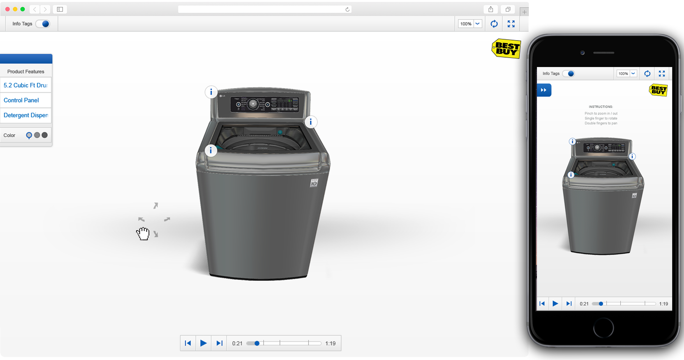
The uability testing
We did 4 rounds of usability testing. Users had a lot of problmes with the rotation, movement of the products. This was an essential feature, something we had to get correct.
Round 1
Round 2
Round 3
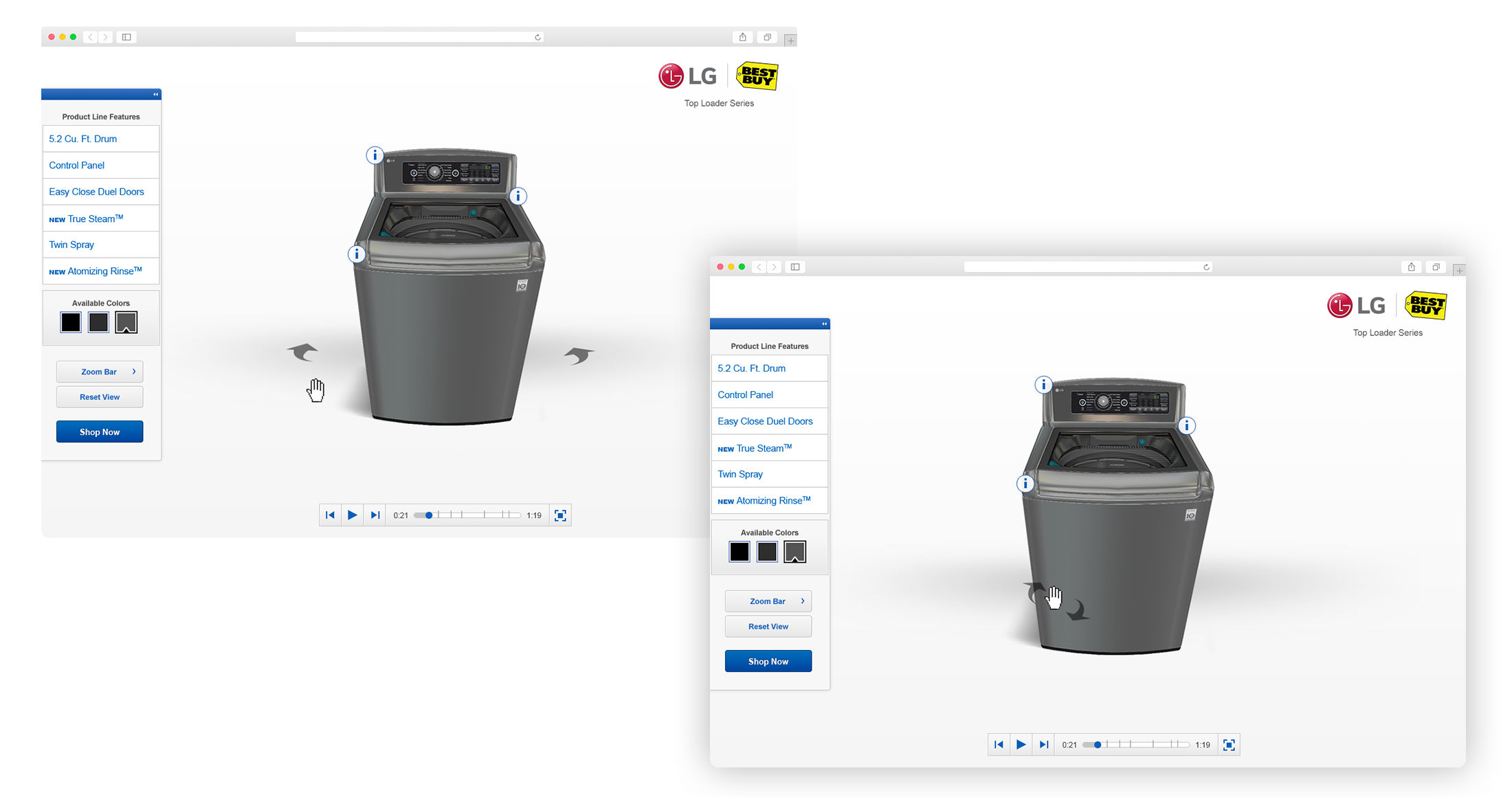
Final Design
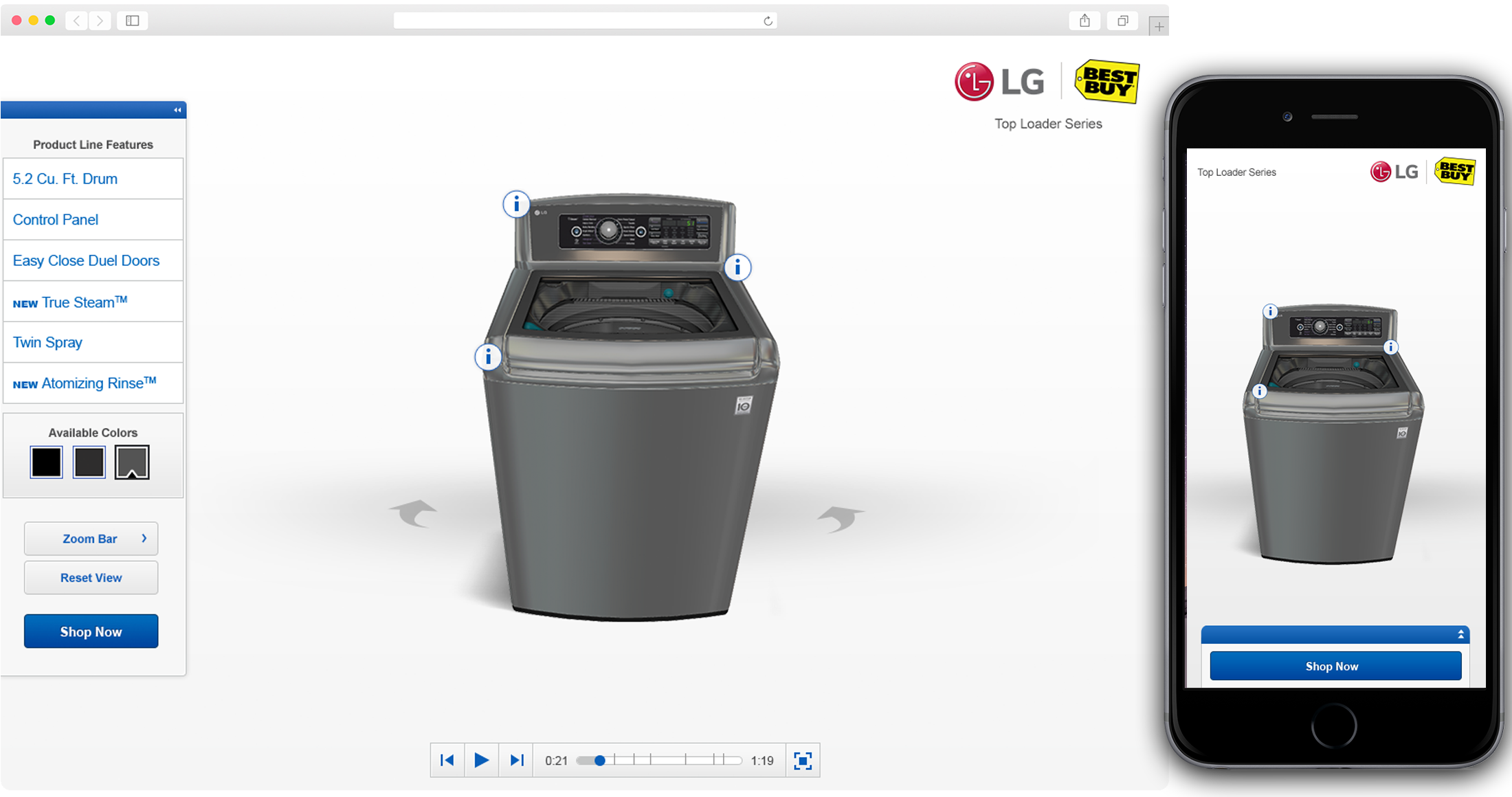
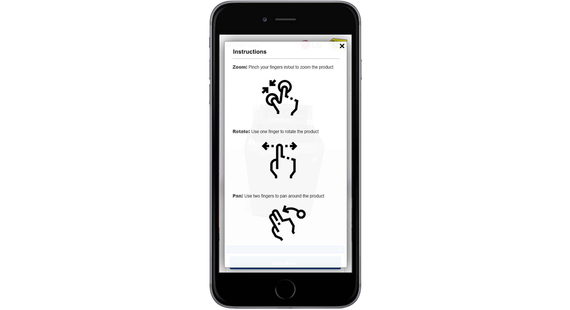
Getting the gestures correct
A user could pan, rotate and zoom the product and by round 4 found the app extremely easy to use.
Launch and success
Customers loved the new 3D viewer. Post-launch customer feedback was very positive and the conversion rates and time spent in the app met or exceeded our KPIs.